Onboarding + Acquisition Strategy
Onboarding is where relationships are built. This project defined the vision and experience strategy for America's Test Kitchen’s freemium and onboarding flows—establishing the tone and design principles that reduce friction and move users toward activation faster, and encourage app discovery and retention.
CLIENT: America’s Test Kitchen
ROLE: Lead Designer - owning strategy, research, UX/UI design, personalization, copywriting, A/B testing, and vision from discovery through delivery.
DELIVERABLES: End-to-end product design
YEAR: 2026
__ Background
The Ask
Develop product vision and experience for free trial flows and app onboarding to reduce friction for new users.
Allow users to enjoy limited free content, determine which what features are exclusive, and create a convertion strategy for free users to subscribers.
The Problem Space
What should we show users for free? How can we demonstrate the value of the ATK app without compromising our business goals, while showing prospective members entry points into our content without giving away the core value it provides?
How might we help users recognize value quickly to lead to an increased pay-up rate?
When should we require sign-up/trial start? What parts of the core value of the app (content and functionality) need to stay behind a paywall and/or be tied to an account?
__ Research
Free Trial Flows
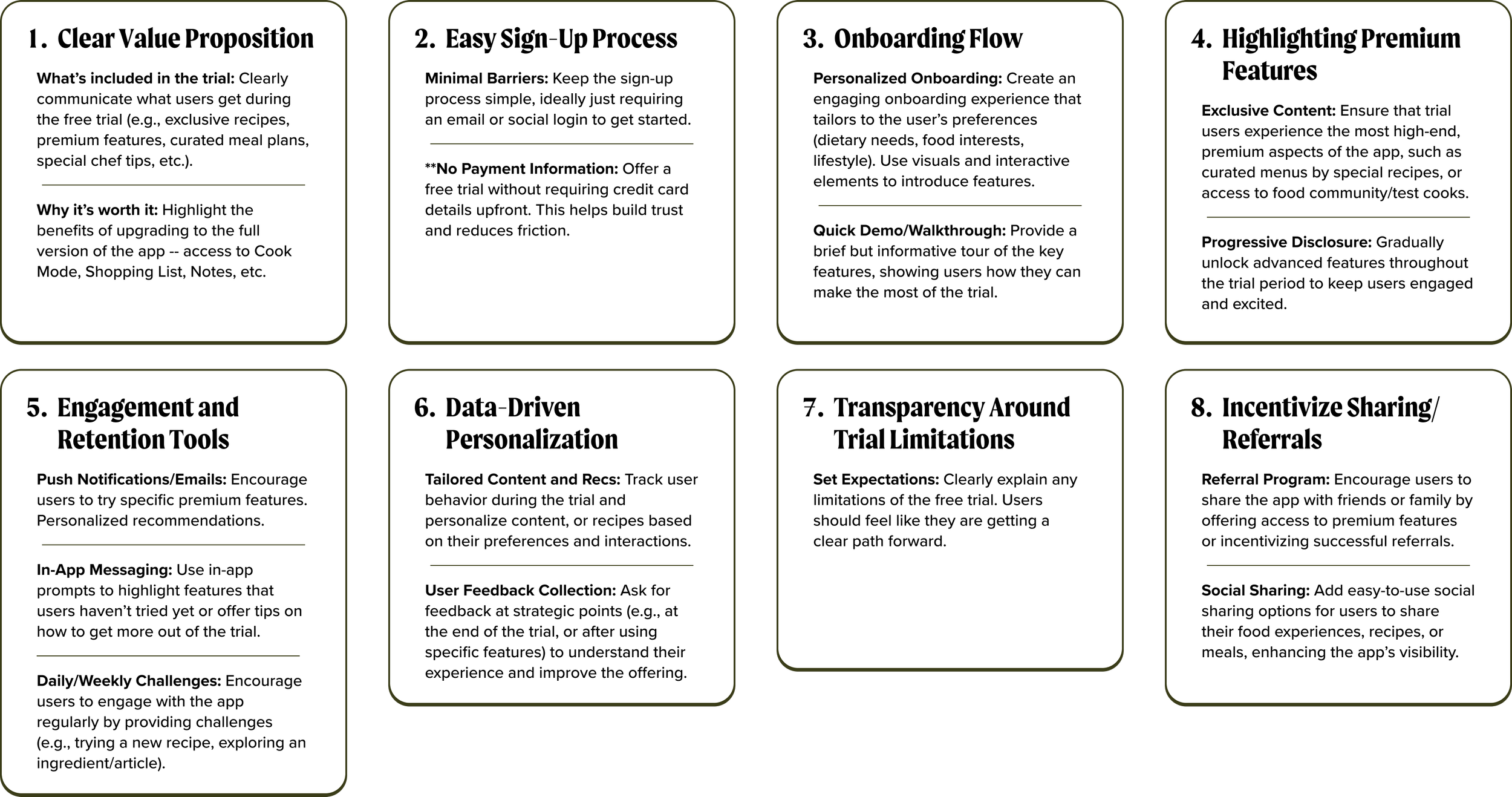
Before designing, I researched what separates a free trial flow that converts from one that loses users along the way. Studying best-in-class products surfaced a set of recurring elements, the building blocks every effective trial flow shares, which became the foundation for our approach.
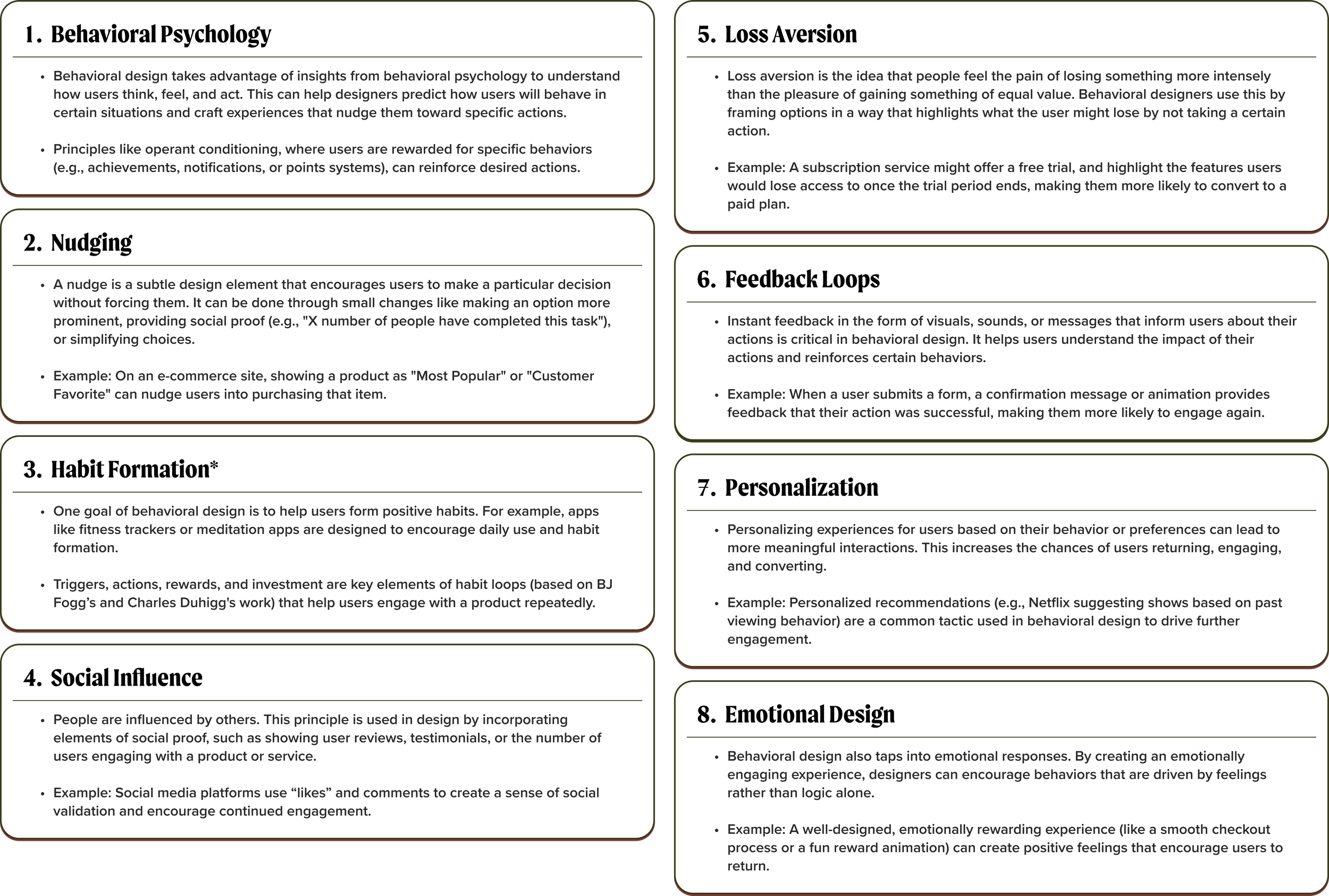
Behavioral Design + Friction Reduction
Drawing on behavioral design—psychology, sociology, and behavioral economics applied to how people actually act—I began to conceptualize where ATK's trial flow created resistance, reshaped those moments to move users toward value rather than away from it, and optimized for points of relational connection with the app and user.
Onboarding Experiences
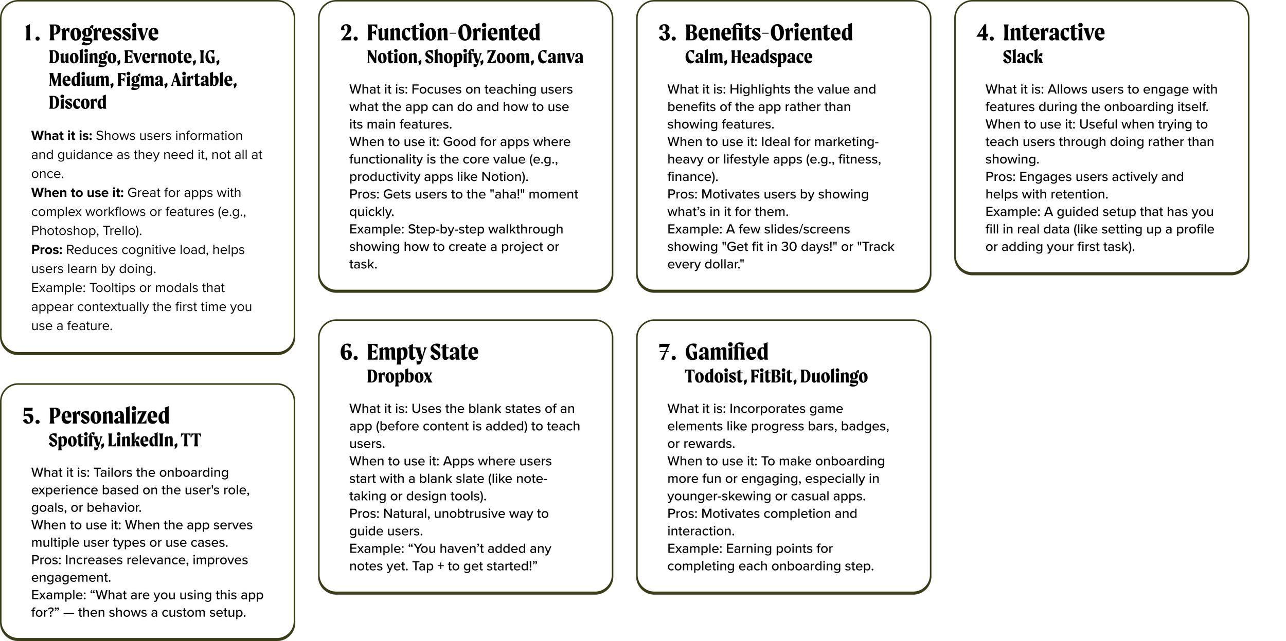
Before picking a design direction, I needed the full picture. I mapped the seven types of onboarding—their strengths, their costs, and who they serve best, then selected the approach that fit ATK rather than the one that's simply most common.
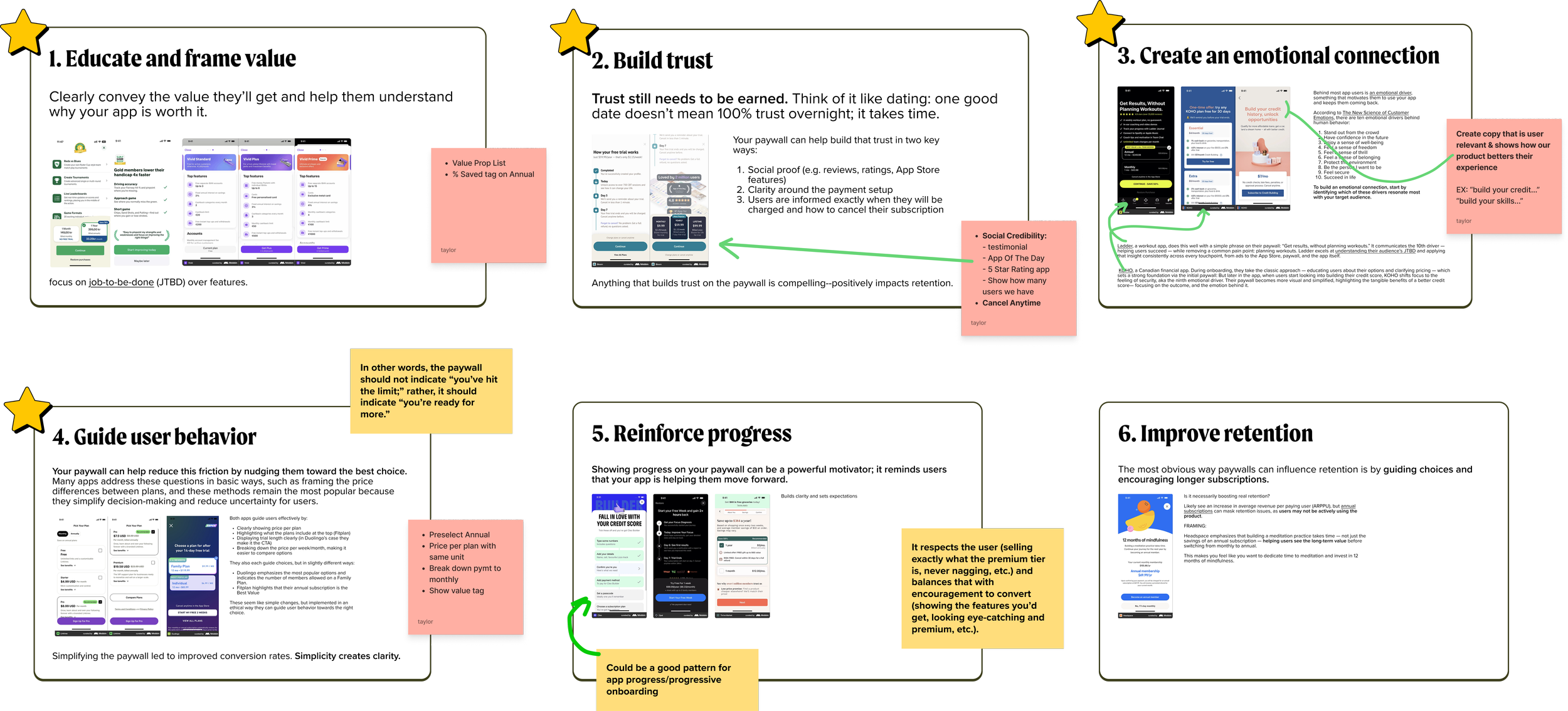
Paywall Strategy
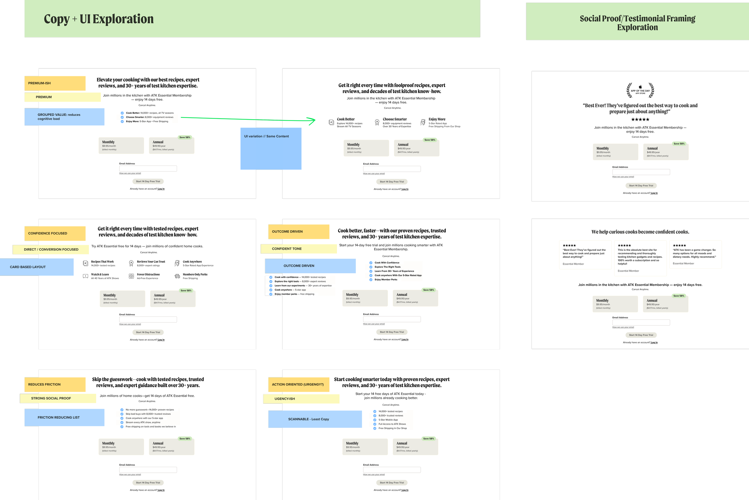
I researched the strategy and best practices behind high-converting paywalls, what to show, when to ask, how to frame the value, and to ground ATK's approach in more than instinct. Our paywalls had historically pushed users away, so rather than another obstacle, I wanted to explore the paywall as something helpful and relational. Creating a moment that builds trust instead of eroding it.
__ Discovery
Competitive Analysis
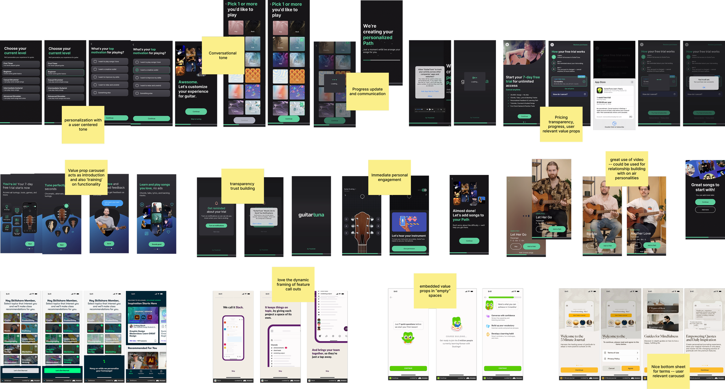
With the foundational research in place, I turned to the competition—studying how leading products handle free trials, onboarding, behavioral friction, and paywalls in the wild. Seeing these principles applied (and misapplied) across real products sharpened what ATK's approach needed to do differently.
Free Trial Flows and Onboarding
I studied companies in and out of the industry for three things: who handled human-centered onboarding best, who explained app features without being heavy-handed, and who made the most of space, time, and interaction.
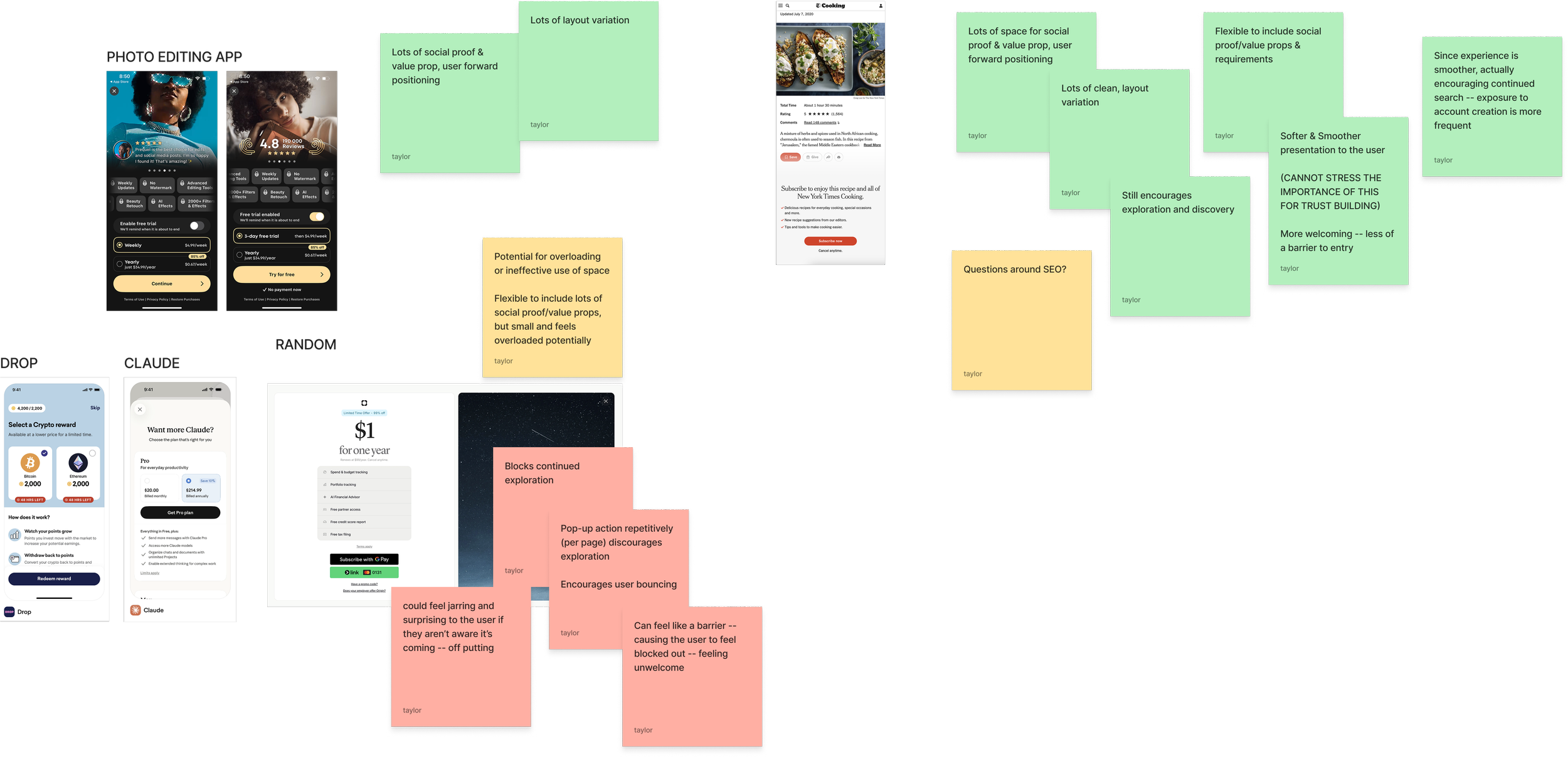
Paywall Strategy: Modal vs. Embedded
Competitive research pointed to three core paywall types: modal, bottom sheet, and embedded. I weighed each against our range of content types and page layouts, guided by a single north star—encourage continued discovery and make the experience more welcoming.
__ Iteration
Wireframes
With the research and competitive analysis behind me, I moved into wireframes—translating what I'd learned into the first tangible version of ATK's onboarding welcome flow. My goal at this stage was to maximize value and connection with the user while meeting the business's requirements. It was also a pivotal moment for building stakeholder buy-in, using storytelling and a shared vision to bring people along.
Free Trial Flows and Onboarding
The first proposed welcome flow balanced brand introduction, personalization, and relationship-building moments between user and brand.
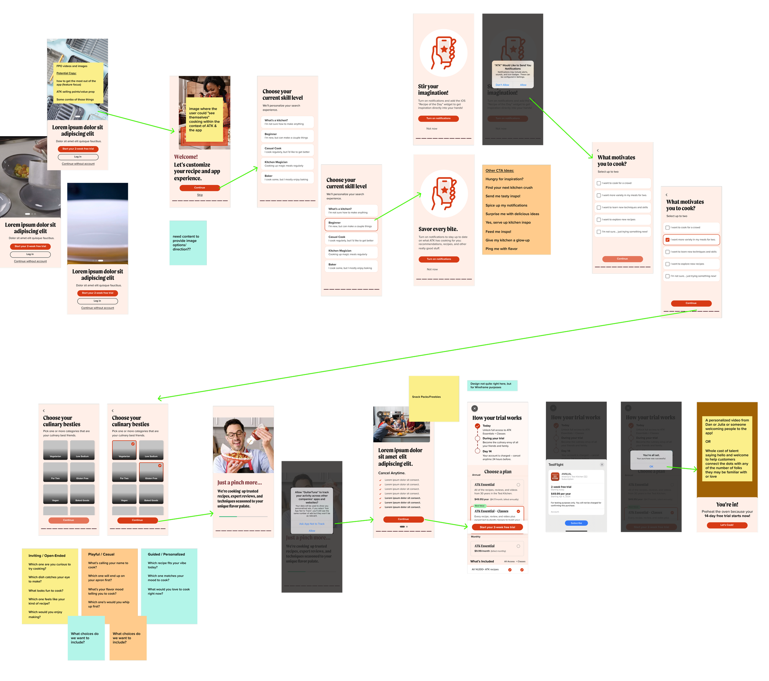
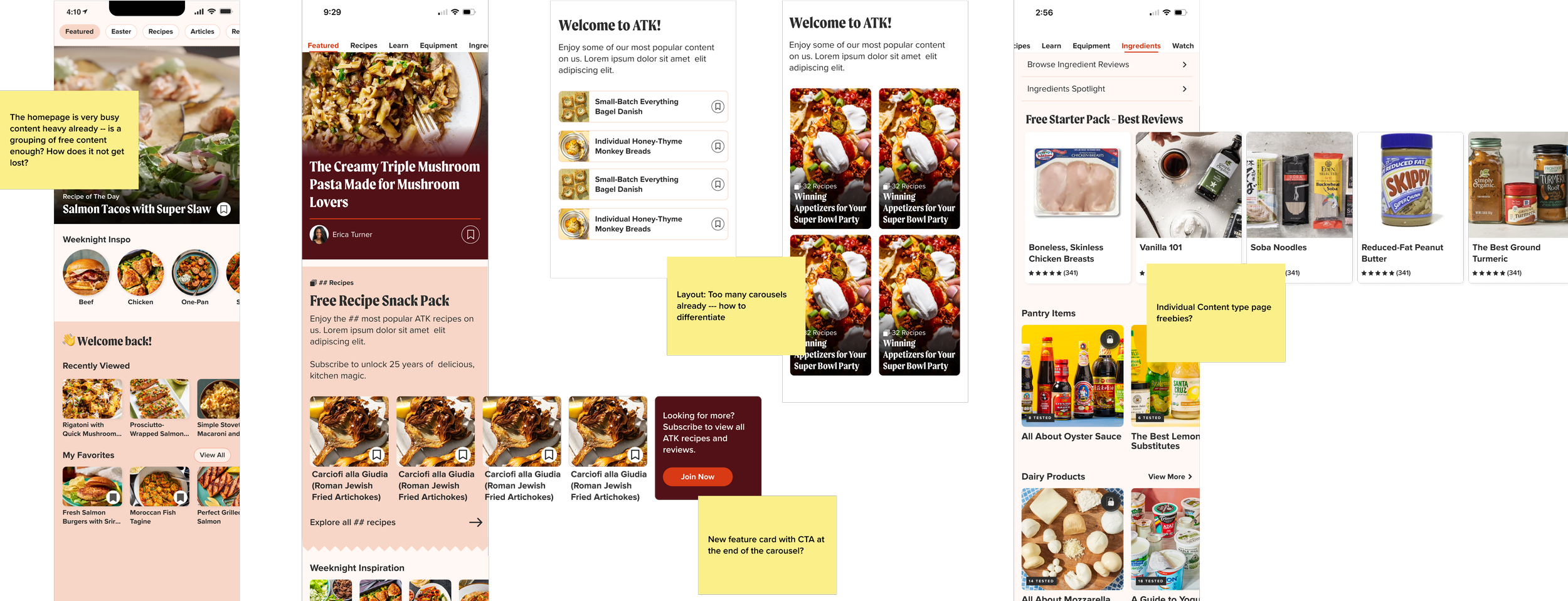
Given limited technical capacity for personalization, the free content strategy centered on a curated set of recipes, articles, and classes. Alongside my PM, we pulled together a cross-department scrum group across data analysis, editorial, and product. The wireframes focused on how to best present the free “Snack Pack” to users.
Paywall Strategy + Copy
The web experience was where paywall strategy mattered most, so we prioritized it first and carried those learnings into app in future iterations.
__ Design System
An added complexity: ATK was in the middle of a company-wide color rebrand, which left this project straddling two different design systems and frameworks. We shifted from reds and pinks to a more natural, food-inspired color palette.
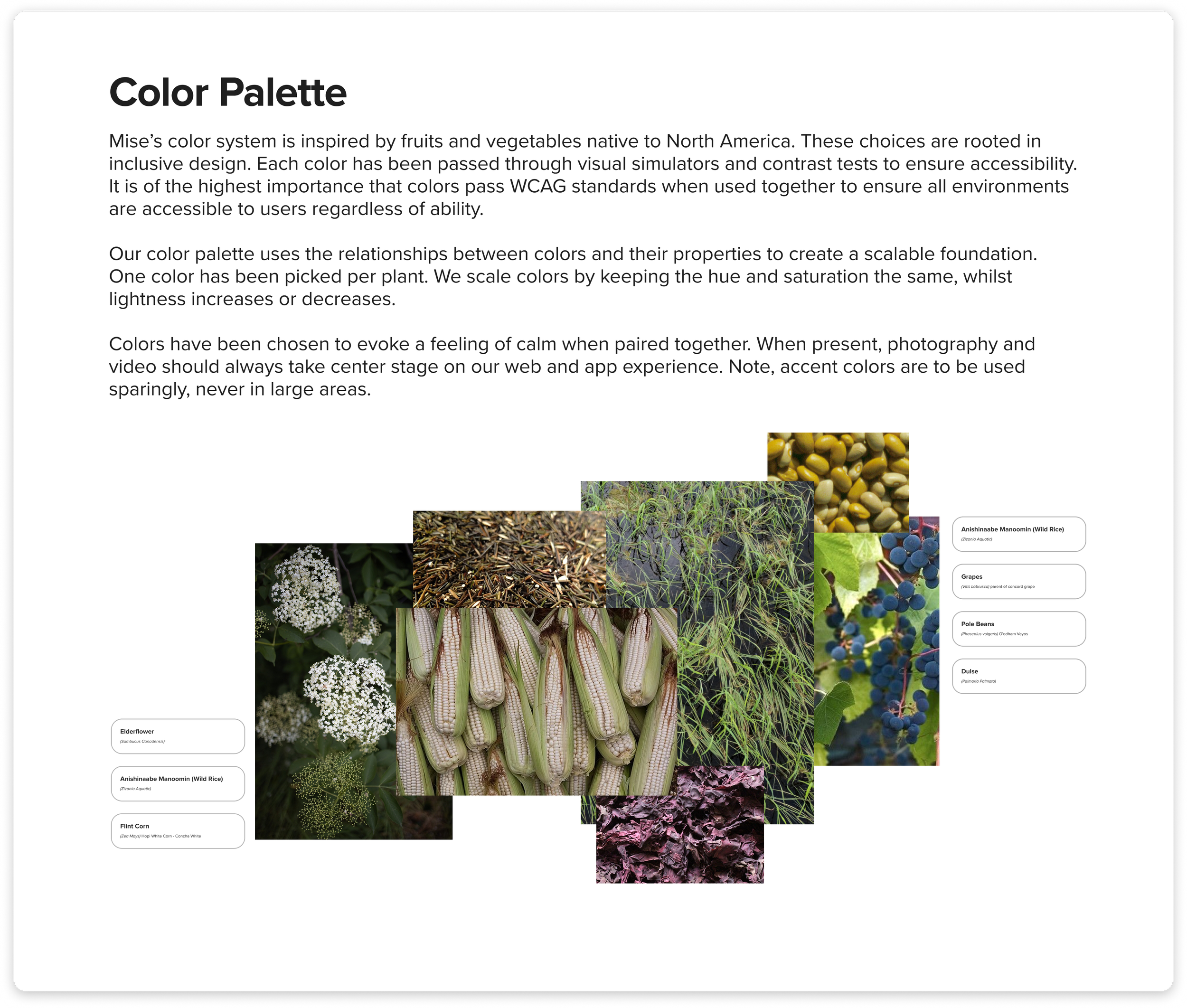
*new palette development was lead by DS lead and maintained by the PD team collectively
__ High Fidelity
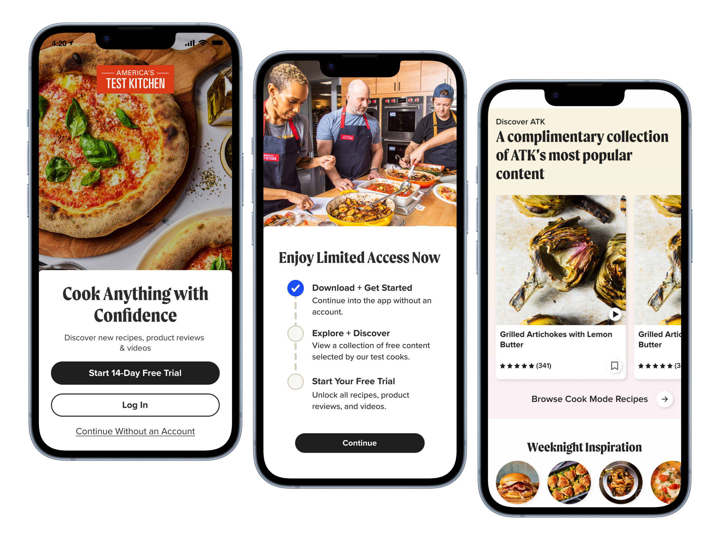
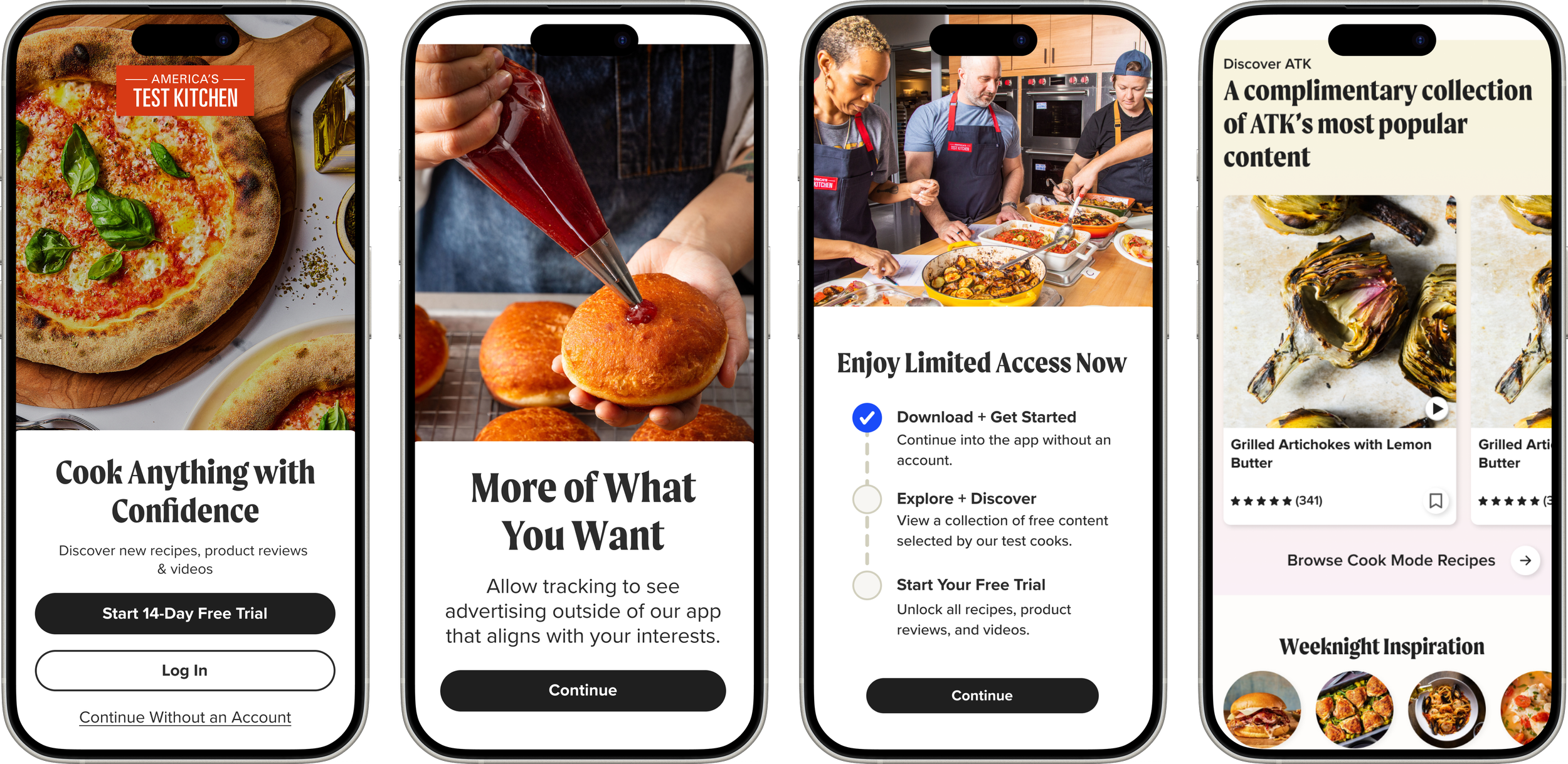
Free Trial Flow + Onboarding
The onboarding welcome screens were cut down considerably from early iterations. We landed on a four-screen flow to keep testing rounds tight and focused, with the intention of taking those findings and iterating further based on user response. The free content strategy, meanwhile, served as a starting point for a larger business alignment.
__ Testing
After handoff and build, we ran extensive quantitative A/B testing in VWO, cutting onboarding to the minimum screens needed to support the experience without friction. Moderated user interviews added the qualitative picture of the new onboarding and free content strategy. Paywall testing ran more iteratively across web, mobile, and app—control versus new design first, then side-by-side subscription offers.
__ Impact
Featured in App Store as app of the day after meeting new iOS requirements
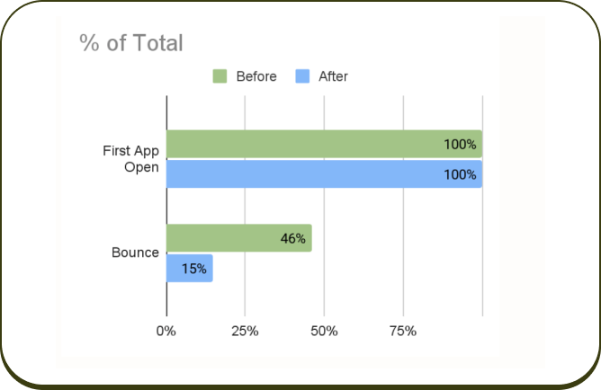
Bounce rate is down considerably since launch (45% to 14%)
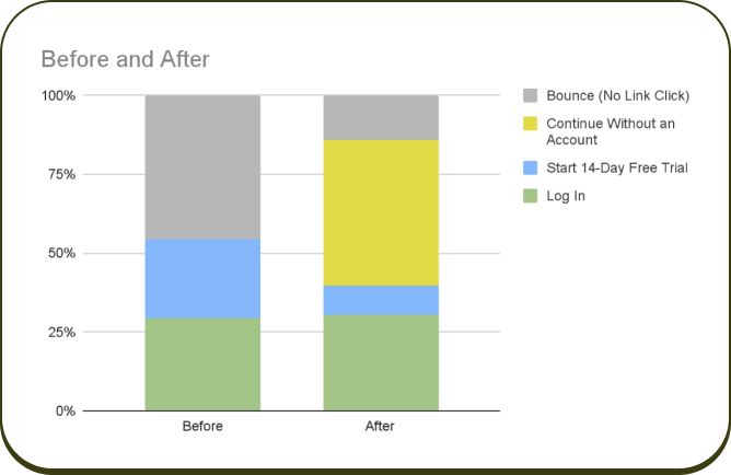
% of users tapping Log In was steady before and after launch
__ Reflection
The Good
We launched ATK's first true onboarding and free content strategy in app, and strengthened the paywalls to better support users—driving more time in the product and deeper exploration.
The project brought us to table stakes in the market and laid a strong foundation to build from, while keeping conversion steady.
The Bad
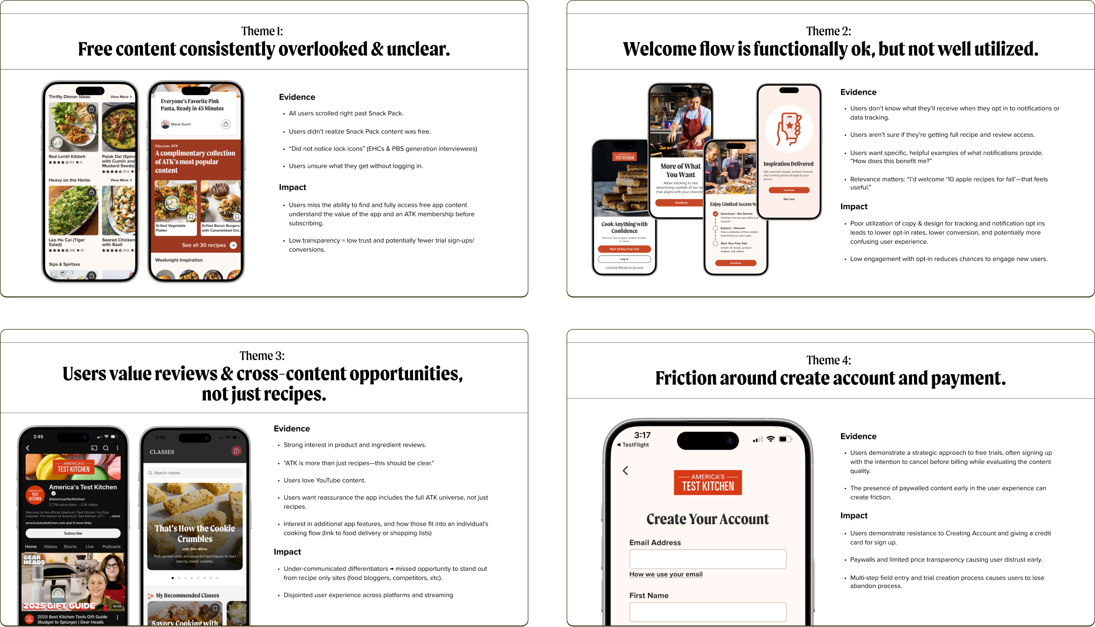
We made significant concessions to the original user-centered, relationship-building concepts, and personalization suffered as a result.
Users also struggled to find the free content collection, largely due to the cognitive overload of the app homepage itself.
The Takeaways
This was a strong start. It earned us a feature as App of the Week in the iOS App Store, let users connect with our content without creating an account, and introduced a cross-department strategy we hadn't explored before.
There's much more I'd pursue in future iterations—but on the whole, the project was a success.
Additional Case Studies
Pet Food Hero App Creation
Drove end-to-end strategy and development of a branded app experience — expanding cost accessibility for premium pet nutrition, surfacing critical customer insights, and cultivating a community platform for health-minded pet owners.
App Redesign + Personalization
Spearheaded a full app redesign initiative, inheriting a developer-built product with a 2.6 App Store rating, elevated churn, and declining subscriber growth — redefining the experience to stabilize retention and reignite digital acquisition.
Read case study →